Election Night 2006 Graphics
On election night 2006, all the U.S. news organizations were working the same story: Can the Democrats take the House of Representatives and Senate?
Each organization had more or less the same data. But how they showed the data was different.
I took the following screenshots around 8:15pm PDT on November 7th. All were from new organizations’ home pages or otherwise accompanied headline-level information—that is, these graphics were meant to convey the essence of the story; they were not “drill downs” of detailed data.
The Washington Post
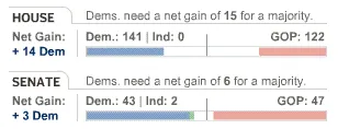
The story is about a relatively small numbers of seats potentially changing hands, so the reference to net gains is good. The graphic is conceptually clever, but I don’t know how many people will understand it at a glance. The white space in the middle of each bar represents undecided seats. The pink and blue bars are racing to be first across the centerline.
CNN
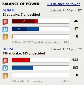
Let’s start with the lower graphic, for the House: I get it, although the scale is odd. The bars are configured as if both sides are racing to 435. Yet as noted at the bottom of the graphic, 218 is the meaningful number. This awkwardness shows the wisdom of the Washington Post’s “race to the centerline” approach, which more clearly reflects that a seat gained for one side is a seat lost for the other.
As for CNN’s upper graphic, for the Senate: Why does each bar have two shades? It’s not only inconsistent with the House graphic but it does not appear to be explained.
Fox News
I had to shrink this one to fit because it ran most of the way across Fox News’ home page.
On first glance, I’d assume that the distribution of red versus blue represents the relative percentage of seats held. However, the amount of red and blue is the same for both House and Senate, even though the numbers are different (Democrats well ahead in the House, Republicans slightly ahead in the Senate).
So apparently the red and blue don’t move with the numbers, and thus do nothing beyond ornamentation.
MSN
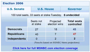
Perhaps in response to Fox’s ornamental graphics, MSN went for an old-school table of numbers. MSN’s Microsoft heritage is evident in the design, which appears to be inspired by a PowerPoint 97 template.
For some reason, I instinctively want that last column to add up to 100. But the “6 undecided” are not in there; they’re only mentioned outside the table. Although that’s defensible, it’s not immediately obvious.
Also, when I saw the column “Seats not at stake,” my first reaction was, “Then why are you showing me them?” In the context of this table, it does makes sense. It just doesn’t invite a good first reaction.
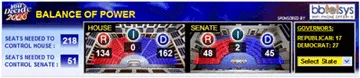
MSDN

Now this is an interesting attempt. You need to perceive that the gauge’s pointer can go left or right, and that leftward is Democrat, and rightward is Republican. If you get that, it’s a good quick-glance view, assuming your eyes are sharp enough to read the gray-on-white numbers.
Nitpicking: Why does the Senate “decided” column have white in it and the House “decided” column does not? And what about independent candidates? For the Senate, where the balance of power turned on only a few seats, two independents won. Seems like that should be part of the visual story.
The New York Times
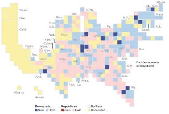
Using a map as a visual metaphor is often a good idea, but not when you distort the map to the point where its lack of fidelity is a distraction. In addition, six color codes is probably too many.
In the Times’ defense, this graphic was doing double duty as a user interface. You could click a square to get more detail on that district. Thus, each square arguably needed to be a minimum size for clickability. Or, counter-arguably, if the above graphic was the result of each square needing to be a minimum size, then they needed to do something different in the first place.
ABC News
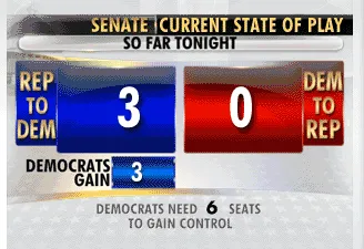
This is my favorite. It’s not about 100 Senate seats; it’s just about the change in balance of power. It tells us the magnitude and direction of change, and it provides the context for how many seats are necessary for the Democrats to take control.
That’s all it does. Works for me.
Round-Up and Wrap-Up
If you scroll back up through the various graphics, you’ll find that other than ABC’s (and, to a lesser extent MSNBC’s and the Washington Post’s), they made the story more complex than necessary. For example:
-
They gave non-essential numbers (for example, MSN’s “Seats not at stake”)
-
The numbers they gave were anchored in total seat counts when the real story was the change in a small number of seats (for example, CNN’s race to 435)
-
They used graphics that confused more than enlightened (for example, Fox’s unchanging red versus blue, the New York Times’ abstract map)
All this goes to say: (1) it’s not easy to create these graphics, and (2) more information is not necessarily better information.
Congratulations to those that managed to keep the numbers, as they say in Washington, DC, “on message.”
Comments (1)
Public commenting is closed. I welcome any private comments or questions.
Steve,
I think the answer to two of your questions:
"As for CNN's upper graphic, for the Senate: Why does each bar have two shades? It's not only inconsistent with the House graphic but it does not appear to be explained."
and
"Nitpicking: Why does the Senate "decided" column have white in it and the House "decided" column does not?"
Is that only part (1/3) of the Senate was up for re-election. Thus, the off colors represent the seats with no races this year.
-john